By Figmafy — Design to Code specialists. Need help turning your Figma files into clean React, Webflow, WordPress, or Shopify builds? Start here.
Free resource: Grab our token starter kit (JSON, CSS vars, Tailwind mapping, and a React Button demo). Enter your email to receive the download link instantly.
Why variables & tokens matter in production
- Consistency across pages, products, and platforms
- Instant theming (light/dark, brand variants)
- Faster handoff & QA because rules are explicit, not implied
Compared with Figma Styles, Variables are structured values with modes (e.g., light/dark). They’re a perfect source of truth for code.
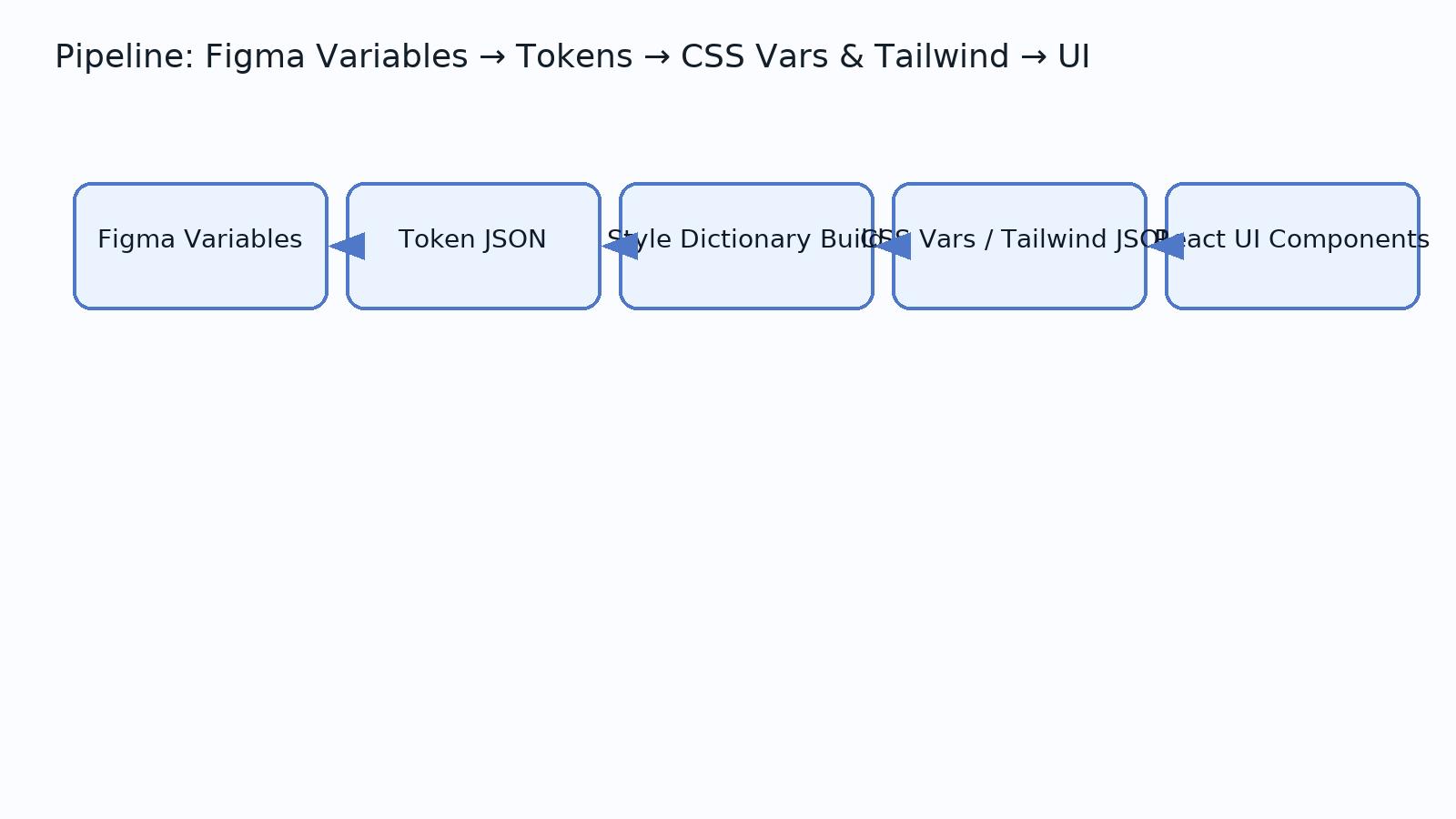
What you’ll build in this guide
- A token
JSONexported from Figma Variables - A global CSS custom properties layer (
:root+[data-theme]) - A Tailwind config that consumes those tokens
- A tiny React button using tokens for color, spacing, and radius
- A repeatable build (Style Dictionary) to keep everything in sync
Prereqs & repo setup
/tokens
/dist/css
/dist/json
/packages/ui/src/components
/apps/web
You’ll use Node, Tailwind, and optionally Style Dictionary (or Tokens Studio) for exports. If you later want this inside React/Next.js or Webflow (CMS), or WordPress (blocks/Elementor), our team can set up a production pipeline quickly.
Export tokens from Figma Variables
- Organize variables into collections:
color,space,radius,font. Use modes likelight/dark. - Name for scale:
color.bg.surface,color.text.primary,space.2,radius.md. - Export via plugin (Tokens Studio) or API. Your JSON might look like:
{
  "color": {
    "bg": { "surface": { "value": "{color.neutral.0}", "type": "color" } },
    "text": { "primary": { "value": "{color.neutral.900}", "type": "color" } }
  },
  "space": { "2": { "value": "8px", "type": "spacing" } },
  "radius": { "md": { "value": "8px", "type": "borderRadius" } }
}
Compile tokens for the web (Style Dictionary)
// style-dictionary.config.js
module.exports = {
  source: ['tokens/tokens.example.json'],
  platforms: {
    css: {
      transformGroup: 'css',
      buildPath: 'dist/css/',
      files: [{ destination: 'tokens.css', format: 'css/variables' }]
    },
    json: {
      transformGroup: 'js',
      buildPath: 'dist/json/',
      files: [{ destination: 'tokens.tailwind.json', format: 'json/nested' }]
    }
  }
};
Wire tokens to CSS custom properties
:root {
  --color-bg-surface: #ffffff;
  --color-text-primary: #0a0a0a;
  --space-2: 0.5rem;
  --radius-md: 0.5rem;
}
[data-theme="dark"] {
  --color-bg-surface: #0a0a0a;
  --color-text-primary: #fafafa;
}
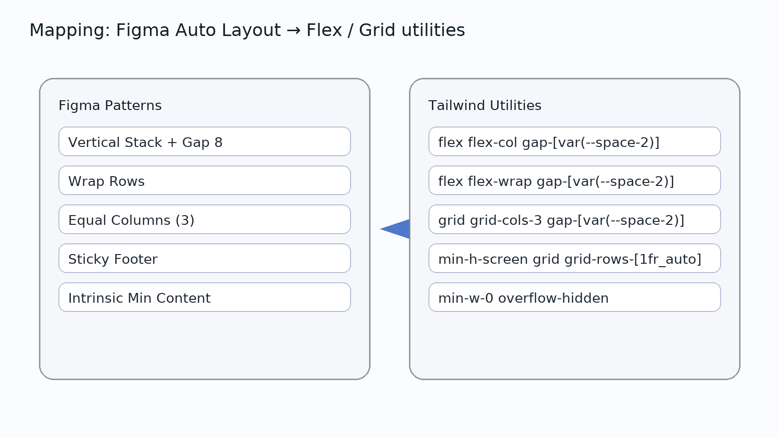
Map tokens to Tailwind
// tailwind.config.js
const tokens = require('./dist/json/tokens.tailwind.json');

module.exports = {
  content: ['./packages/ui/**/*.{js,jsx,ts,tsx}', './apps/web/**/*.{js,jsx,ts,tsx,html}'],
  theme: {
    extend: {
      colors: {
        bg: { surface: 'var(--color-bg-surface)', muted: 'var(--color-bg-muted)' },
        text: { primary: 'var(--color-text-primary)', muted: 'var(--color-text-muted)' }
      },
      spacing: tokens.space,
      borderRadius: tokens.radius
    }
  }
};
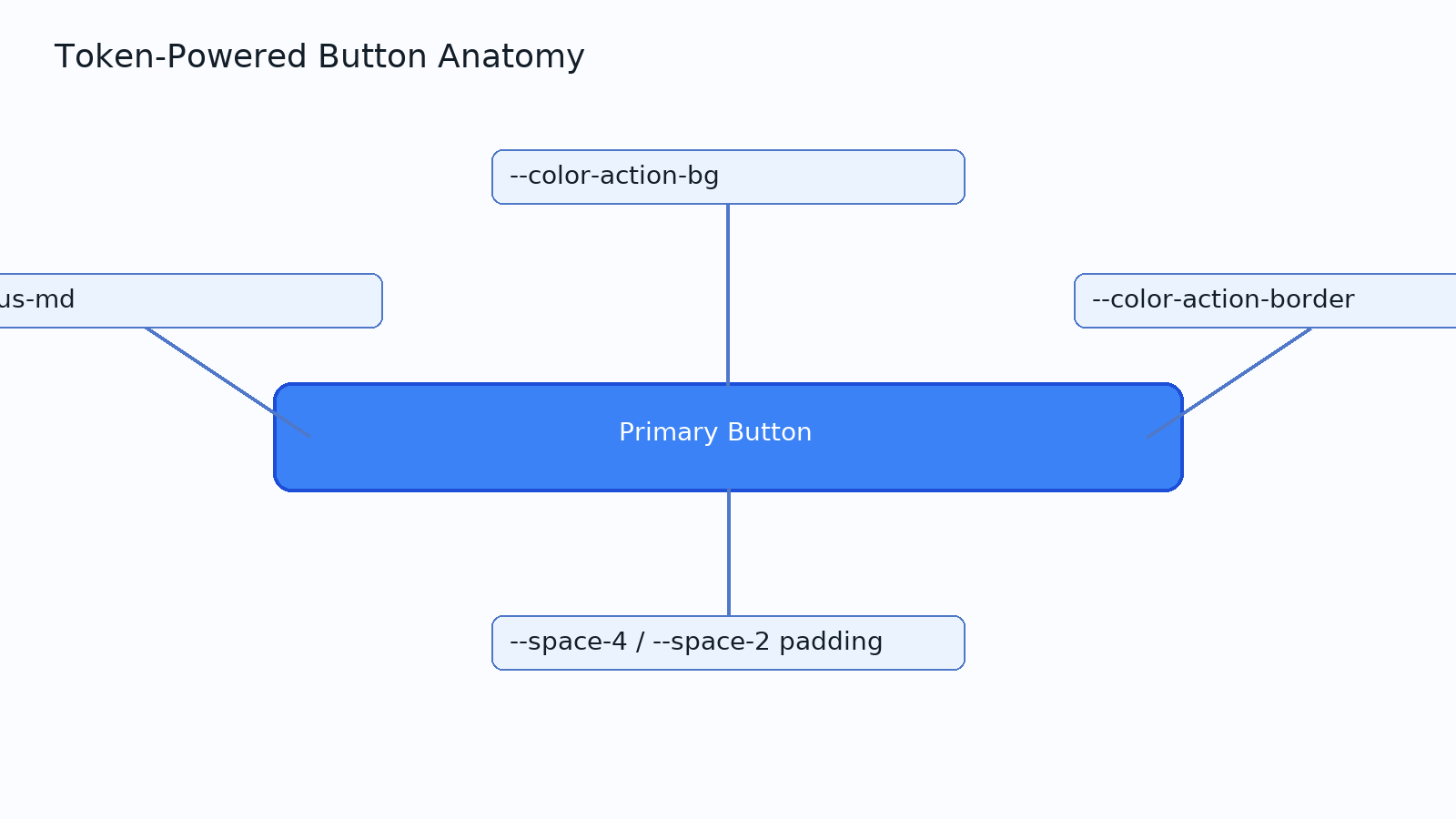
Build a token-powered React button
CI/CD: keep tokens in sync
- Label PRs that touch
/tokens; run token build in CI. - Tag design “freeze” versions in Figma; publish a matching package/tag in code.
- Use visual diffs (Storybook + Percy/Loki) to catch breaking theme changes.
Common pitfalls (and fixes)
- Over/under-granularity: keep semantic tokens stable; let brand tokens change.
- Duped values across modes: alias, don’t copy.
- Hardcoded values in components: lint against raw hex/px where tokens exist.
- No contributor guardrails: document naming rules and do/don’t examples.

